Back to Geoff Draper's Home Page

I am a professor of computer science at Brigham Young University–Hawaii. Here's a copy of my CV. My current research interests are in the fields of information visualization and digital storytelling.

Quick Links:
My Curriculum Vitae
Spiral Visualization for Mobile Devices
Teaching Data Visualization
Radial Visualization of Well-Ordered Sets
Timeline-Enhanced Portrait Charts
Radial vs. Cartesian Visualization
Hypertext Fiction for Mobile Devices
Visual Diffs in SQiRL
SQiRL for Education
SQiRL for Genealogy
Radial Visualization
SQiRL
Visual Query Languages
Interactive Fan Charts
History of Computing
Computer Science Education
Video Game Restoration/Preservation
Gestural Interfaces for 3D Graphics
Terrain Visualization


Spiral Visualization for Mobile Devices

screenshot of Temples Timesline app Hundred Chinese Surnames project presented at the 2021 IEEE Pacific Visualization conference (scroll down to poster #7).
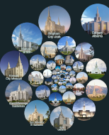
Temples Timeline project published in BYU Studies Quarterly, October 2021 issue.
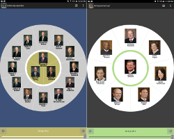
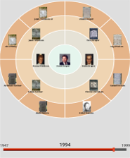
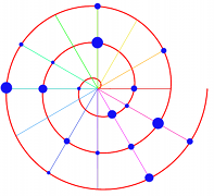
We propose an interactive radial visualization of tabular data optimized for mobile devices. Our visualization employs a spiral layout, making it suitable for small handheld touchscreens. Users can view an overview of the data, search for specific items, and access details as needed. As a proof of concept of our visualization metaphor, we have implemented two mobile applications: Temples Timeline and Hundred Chinese Surnames. The first shows a chronology of temples operated by the Church of Jesus Christ of Latter-day Saints from 1836 to the present. The second app provides an interactive visualization of the most common Chinese surnames.
Read the Pacific Visualization paper | Hundred Chinese Surnames demo video | Download Hundred Chinese Surnames: Google Play or Amazon Appstore
Read the BYU Studies paper | Temples Timeline demo video (English) | Temples Timeline demo video (Chinese) | Download Temples Timeline: Google Play or Amazon Appstore or Apple App Store

Teaching Data Visualization

screenshot of MP3 visualization program Published in the September 2019 issue of ACM Inroads.
We present a course that introduces undergraduate students to the concepts of graduate school, using data visualization as the topic of study. Students read seminal papers in the field of data visualization and implement many of its core algorithms. By the end of the course, students who may not have otherwise considered graduate studies as an option can make an informed decision about whether to attend graduate school or join the workforce upon graduation.
Read the ACM Inroads paper

Radial Visualization of Well-Ordered Sets

screenshots of apostles and supreme court app Featured in the May 2016 issue of BYU Studies.
Presented at the 9th International Symposium on Visual Information Communication and Interaction (VINCI 2016).
We propose a radial method for visualizing well-ordered sets that vary over time. Rather than render an overview of the entire data set, we display a single snapshot of the data at a given moment in time, and allow the user to easily navigate forwards and backwards in time to view other snapshots. Transitions from one snapshot to another are smoothly animated to preserve context. This approach seems well-suited to handheld mobile devices. As a proof of concept of this idea, we have implemented two mobile apps: Latter-day Apostles and U.S. Supreme Court. The first shows the chronology of the senior leadership of the Church of Jesus Christ of Latter-day Saints from 1832 to the present day. The second shows the chronology of the United States Supreme Court from 1789 to today.
Read the BYU Studies paper | Read the VINCI 2016 paper | Photo from VINCI 2016 poster session | Download Latter-day Apostles: Google Play or Amazon Appstore | Download US Supreme Court: Google Play or Amazon Appstore

Timeline-Enhanced Portrait Charts

Screenshot of Timeline-Enhanced Portrait Charts, Android prototype Presented at the 15th Annual Family History Technology Workshop (FHTW 2015).
One popular feature of many genealogical software packages is the ability to render one's family tree in a number of different designs. One such design is the portrait chart, which augments the traditional text-only family tree with portraits of each individual. Portrait charts add a human touch to genealogical graphs by letting viewers associate faces with names. However, one potential drawback to portrait charts is that, while there may exist many photos of an individual as he or she ages, a traditional portrait chart can only show one image per person. We propose a timeline-enhanced portrait chart, an interactive tool in which the user can select a certain date, and the chart updates to display a photo of each individual that was taken on or before that date.
Photos from the workshop

Radial vs Cartesian Visualization

Screenshot of SQiRL, in Cartesian mode Presented at the 7th International Symposium on Visual Information Communication and Interaction (VINCI 2014).
Radial visualization continues to be a popular design choice in information visualization systems, due perhaps in part to its aesthetic appeal. However, it is an open question whether radial visualizations are truly more effective than their Cartesian counterparts. In this paper, we describe an initial user trial from an ongoing empirical study of the SQiRL visualization system, which supports both radial and Cartesian projections of stacked bar charts. Our initial findings suggest that, in spite of the widely perceived advantages of Cartesian visualization over radial visualization, both forms of layout are, in fact, equally usable. Moreover, radial visualization may have a slight advantage over Cartesian for certain tasks.
Read the paper

Hypertext Fiction for Mobile Devices

Screenshot of Jarnaby, running on the iPhone Presented at the 2nd Annual Workshop on Narrative and Hypertext - colocated with the ACM Hypertext 2012 conference.
Electronic literature has seen an explosion in popularity in recent years, due largely to the wide availability of smartphones, tablets, and dedicated e-reader devices. Somewhat surprisingly, mobile computing has been slow to embrace hypertext fiction. Yet the same qualities that make handheld devices popular for traditional linear narratives — small size, ease of use, and near ubiquity — also make them ideally suited for the distribution and consumption of hypertext narratives. In this paper, we review some existing systems for reading hypertext literature on mobile devices, and introduce Jarnaby Reader, a prototype e-reader for hypertext narratives that supports automatically generated overhead maps.
Jarnaby Home Page | Read the paper | Watch the demo video (YouTube)

Visual Diffs in SQiRL

Screenshot of Visual Diff in SQiRL Presented at the SPIE Conference on Visualization and Data Analysis 2012.
SQiRL is a novel visualization system for querying and visualizing large multivariate data sets. Although initially designed for novice users, recent extensions to SQiRL facilitate more advanced analysis without sacrificing the simplicity that makes this visualization appealing to beginners. The default view provides a simple-to-learn interface for query evaluation. Intermediate users are provided a straightforward method for comparing the results of two queries. More advanced users can make use of a radial crosstab, a new interactive visualization technique that melds the expressive power of traditional crosstabulation with a drag-and-drop canvas.
SQiRL Home Page | Read the paper | Conference photos

SQiRL for Education

Screenshot of
SQiRL softwarePresented at the 2010 Information Systems Educators Conference.
The use of computer software to facilitate learning in political science courses is well established. However, the statistical software packages used in many political science courses can be difficult to use and counter-intuitive. We describe the results of a preliminary user study suggesting that visually-oriented analysis software can help students query a political data set faster and more accurately than by using traditional non-visual software tools. We hope that our experience will encourage future collaboration between educators in computing and in other academic disciplines.
SQiRL Home Page | Read the paper

SQiRL for Genealogy

Screenshot of 
SQiRL software Presented at the 2010 Workshop on Technology for Family History and Genealogical Research.
Most genealogy software is designed to make it easy to view and edit data about individuals and their relationships to others. While this is very useful, sometimes it is desirable to view information and discover trends about hundreds or thousands of individuals all at once. We present a graphical visualization system for formulating queries and viewing their results for large populations rather than for individuals. Our method works with the GEDCOM standard, and is designed for ease of use and interactivity.
SQiRL Home Page | Read the paper

Radial Visualization

spiral visualization Published in IEEE Transactions on Visualization and Computer Graphics (TVCG).
Radial visualization, or the practice of displaying data in a circular or elliptical pattern, is an increasingly common technique in information visualization research. In spite of its prevalence, little work has been done to study this visualization paradigm as a methodology in its own right. We provide a historical review of radial visualization, tracing it to its roots in centuries-old statistical graphics. We then identify the types of problem domains to which modern radial visualization techniques have been applied. A taxonomy for radial visualization is proposed in the form of seven design patterns encompassing nearly all recent works in this area. From an analysis of these patterns, we distill a series of design considerations that system builders can use to create new visualizations that address aspects of the design space that have not yet been explored. It is hoped that our taxonomy will provide a framework for facilitating discourse among researchers and stimulate the development of additional theories and systems involving radial visualization as a distinct design metaphor.
Read the paper

SQiRL, a Tool for Visual Data Analysis

Screenshot of SQiRL software Presented at the IEEE Information Visualization Conference 2008.
Surveys and opinion polls are extremely popular in the media, especially in the months preceding a general election. However, the available tools for analyzing poll results often require specialized training. Hence, data analysis remains out of reach for many casual computer users. Moreover, the visualizations used to communicate the results of surveys are typically limited to traditional statistical graphics like bar graphs and pie charts, both of which are fundamentally noninteractive. We present a simple interactive visualization that allows users to construct queries on large tabular data sets, and view the results in real time. The results of two separate user studies suggest that our interface lowers the learning curve for naive users, while still providing enough analytical power to discover interesting correlations in the data.
SQiRL Home Page | Read the paper | Watch a demo video (YouTube)

Visual Query Languages

Screenshot of Manager's Dartboard software Presented at the 2nd Annual Visual and Iconic Language Conference.
We introduce an interactive radial query language for simplifying the task of searching for and identifying subtle correlations within a data set. Our approach allows the user to select which entities to show relationships for, thus decreasing the cognitive overload associated with static chart-based representations. We likewise present a compact visual metaphor for comparing the differences between two versions of a chart. We have also implemented an intuitive gesture-based interface for creating and removing links between entities, thus enabling users to edit data, not just view it. Our preliminary user trial suggests that users can discover correlations significantly more quickly and accurately with our method as compared to traditional chart representations.
Read the paper | Watch a demo video (YouTube) | Download the software

Interactive Fan Charts

Screenshot of interactive fan chart prototype Presented at the 2008 Workshop on Technology for Family History and Genealogical Research.
Fan charts are a popular method for visualizing family trees, due perhaps in part to their aesthetic appeal as well as their compact appearance relative to the more common tree-based pedigree chart. Although fan charts are easy to understand, they do not necessarily make optimal use of the available space. Thus, we propose the interactive fan chart: a radial graph in which nodes can be selectively expanded or collapsed so that a greater proportion of the available space is dynamically allocated to nodes of current interest. In addition, we introduce a number of interactive techniques that elevate fan charts from a static display medium into a tool for real-time data browsing and exploration.
Read the paper | Download the source code

History of Computing

Photograph of a DEC PDP-11 The progress of computing technology in the last five decades has been nothing short of miraculous. However, in some ways, computer science has progressed very little. If we are not familiar with the history of computer science, including why certain decisions were made and what the consequences were, we may mistakenly think that “it's always been this way” — or worse yet, that “it has to be this way.” Either one of these beliefs only stifles future innovation in computing. As a proactive step to reverse this trend, I developed and taught a new senior-level undergraduate course for Spring 2008 entitled History of Electronic Computing. However, it is not a “history class” in the traditional sense of the term. My purpose in this course is not simply to present an exhaustive review of all computers, but to give students the opportunity to think critically about where the industry has been, and to challenge their assumptions about where it can go in the future — under their leadership.
CS 4960 course web site

Computer Science Education

A mascot I drew for my CS 1021 class Education and entertainment are more closely related than we often suppose. I believe in a fun, hands-on approach to computer science education, using humorous in-class demonstrations and creative assignments to keep students engaged. Students flourish when given individual attention, so I try to meet with my students one-on-one as much as possible. During the summer of 2007, I taught two introductory programming courses in the University of Utah's School of Computing, one in C++ and the other in Java.
CS 1020 course web site | CS 1021 course web site

Video Game Restoration/Preservation

Screenshot of Milk Room in Thirsty Nellan Over the past three decades, hobbyist programmers have created a wealth of computer games for a variety of platforms. Unfortunately, many of these games are now forgotten — not because they weren't high quality, but because the platforms for which they were originally written are no longer in common use. Emulators and virtual machines provide only a partial solution. Indeed, the surest way to preserve old games for future audiences is to rewrite them entirely. I therefore present Thirsty Nellan, a re-make of the 8-bit text adventure “Nellan is Thirsty,” now rewritten for modern platforms. The new version makes this classic game accessible to a whole new audience, while remaining faithful to the storyline of the original.
Read the Linux Journal article | Download the game

Gestural Interfaces for 3D Graphics

Screenshot of Freddy prototype Presented at Graphics Interface 2003.
We introduce Freddy, a gesture-based user interface to Free-Form Deformation (FFD). Traditional interfaces for FFD require the manipulation of individual points in a lattice of control vertices, a process which is both time-consuming and error-prone. In our system, the user can bend, twist, and stretch/squash the model as if it were a solid piece of clay without being unduly burdened by the mathematical details of FFD. We provide the user with a small but powerful set of gesture-based “ink stroke” commands that are invoked simply by drawing them on the screen. The system automatically infers the user’s intention from the stroke and deforms the model without any vertex-specific input from the user. Both the stroke recognition and FFD algorithms are executed in real-time on a standard PC.
Read the paper | Demo Video (YouTube) | Download Freddy | Read my Master's Thesis

Terrain Visualization

Screenshot of a fly-through over BYU campus Consider a six-gigabyte geographic database of the Wasatch front which, due to limitations in the elevation data, shows all the buildings as flat, not rising up at all from the ground. This artifact is not noticeable when performing high-altitude fly-bys, but is unsuitable for close-range walkthroughs. We have devised an automated system to extrude buildings of any height from the otherwise flat terrain. Users can interactively select areas on the terrain where they wish to add buildings, and then our system generates a new version of the landscape, complete with full-size three-dimensional buildings at the chosen locations.
Read my senior thesis

Home | Comics | Games | Stories | Research | About Me